Same Same but Different
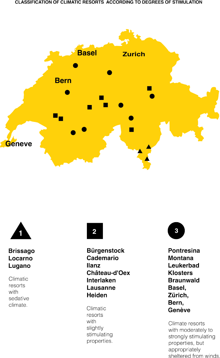
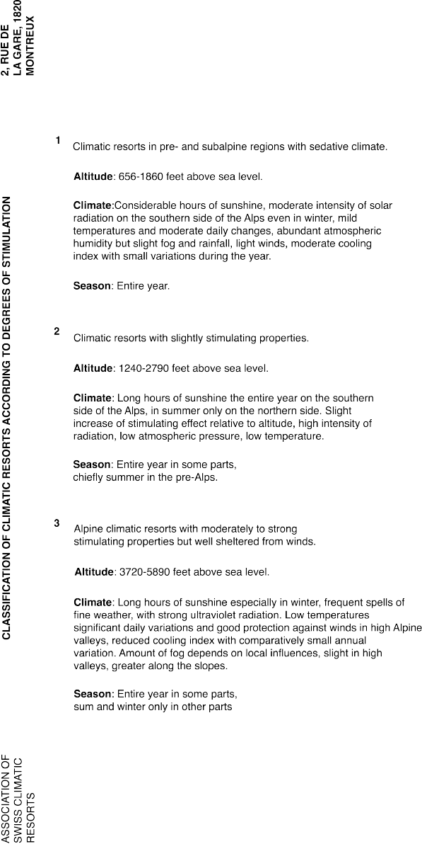
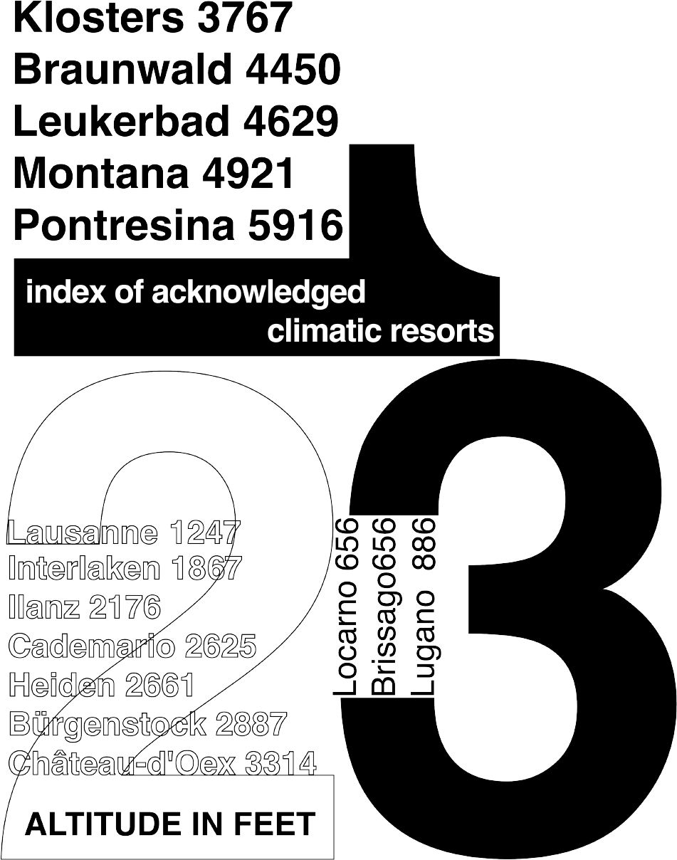
This project focused on exploring typographic hierarchy using a single typeface at a consistent size, applied across varying weights. The assignment has been a longstanding tradition, passed down through design programs for generations. My professor, who once worked alongside Armin Hofmann, encouraged us to continue this exercise as a way to honor Hofmann’s lasting influence on modern typography.


“All mockup photos are sourced from licensed stock imagery and are presented exclusively for design exploration and visualization purposes. Created for portfolio purposes only.”
