
Rebrand
For this academic project, I completed a full rebrand for Amqui Station a Nashville farmers market. The work included redesigning the logo, updating signage, developing the website, producing every door direct mailers (EDDM), and creating cohesive merchandise and advertising assets. I also helped creatively direct video footage to evoke the desired emotional tone and support the refreshed brand identity. This project demonstrates my ability to build a unified visual presence across digital, print, and multimedia platforms.
Logo Animation
Animation was developed for use across multiple digital platforms, enhancing brand recognition and adding visual interest to web, social media, and promotional content. Amqui's motion design reinforces the brand’s personality while maintaining consistency with the established identity system
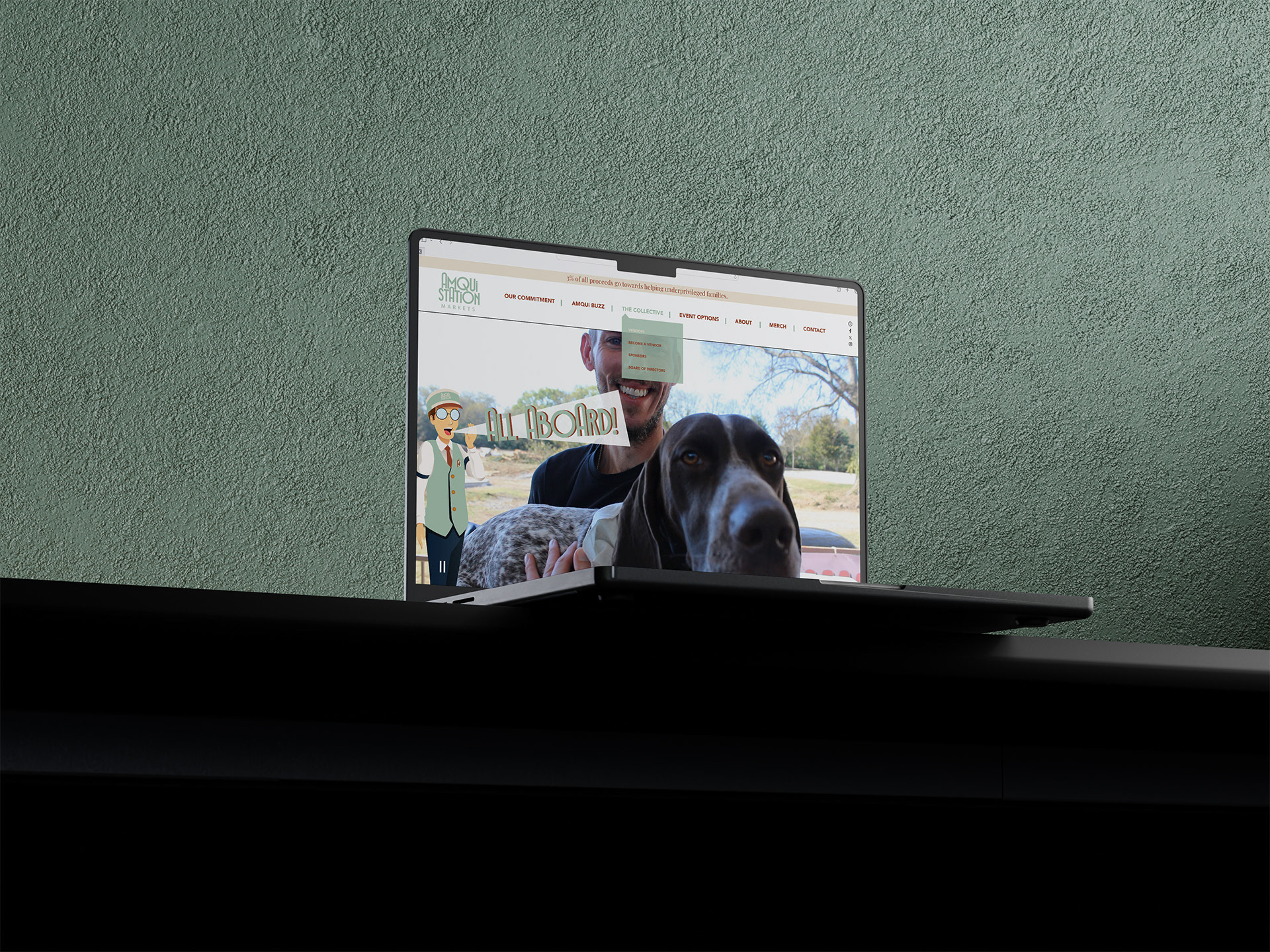
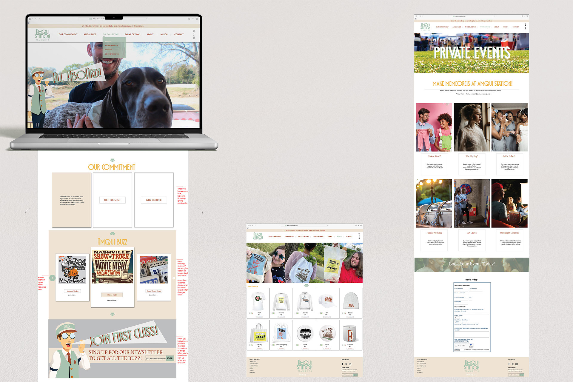
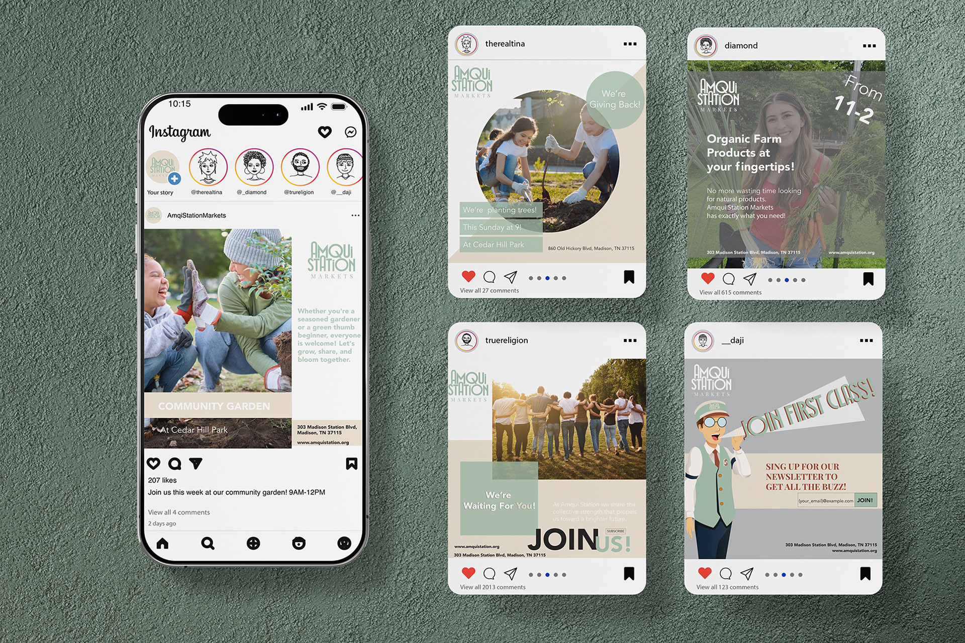
Website (Full Landing Page + 2 Full Sub pages), Advertisement & Signage
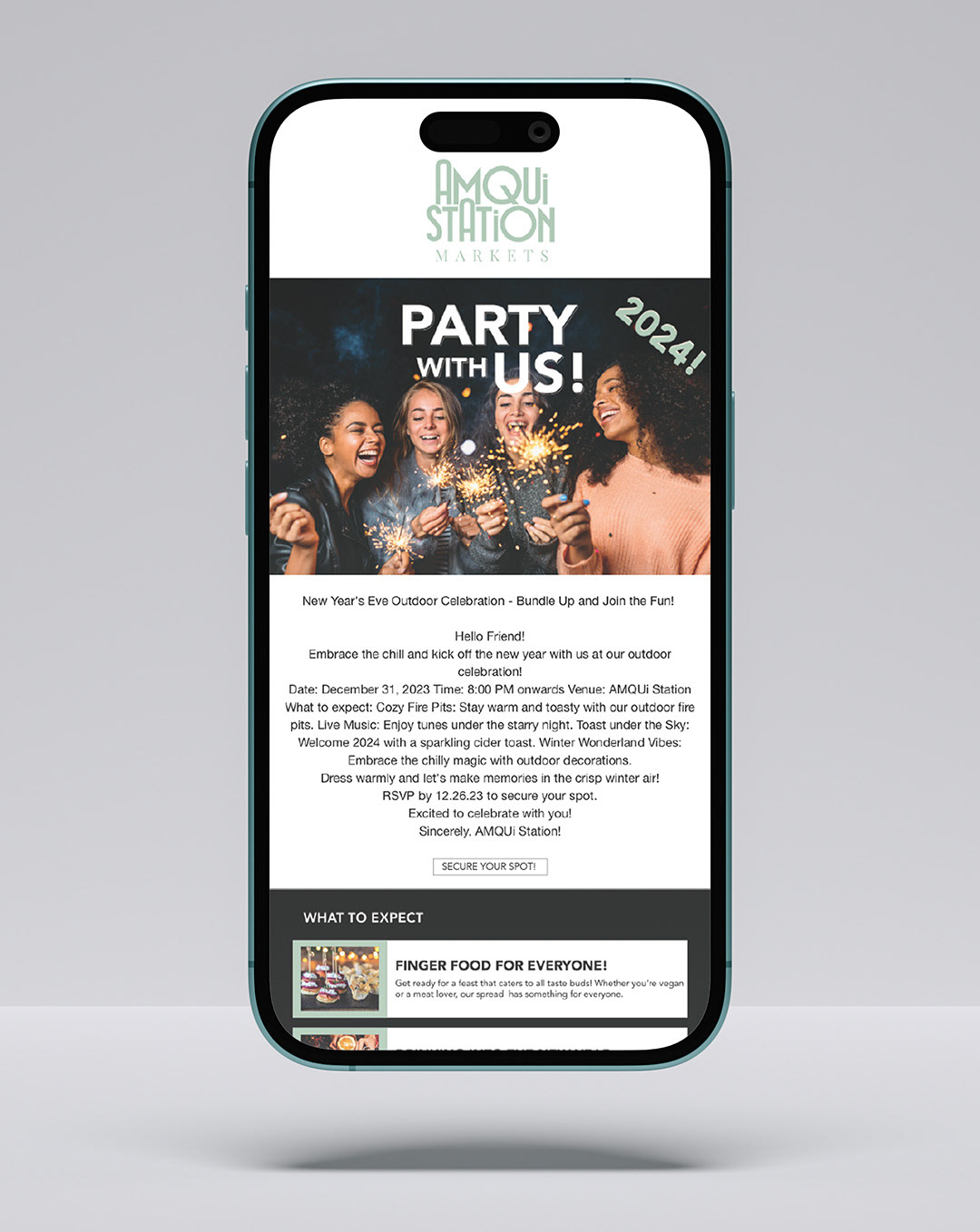
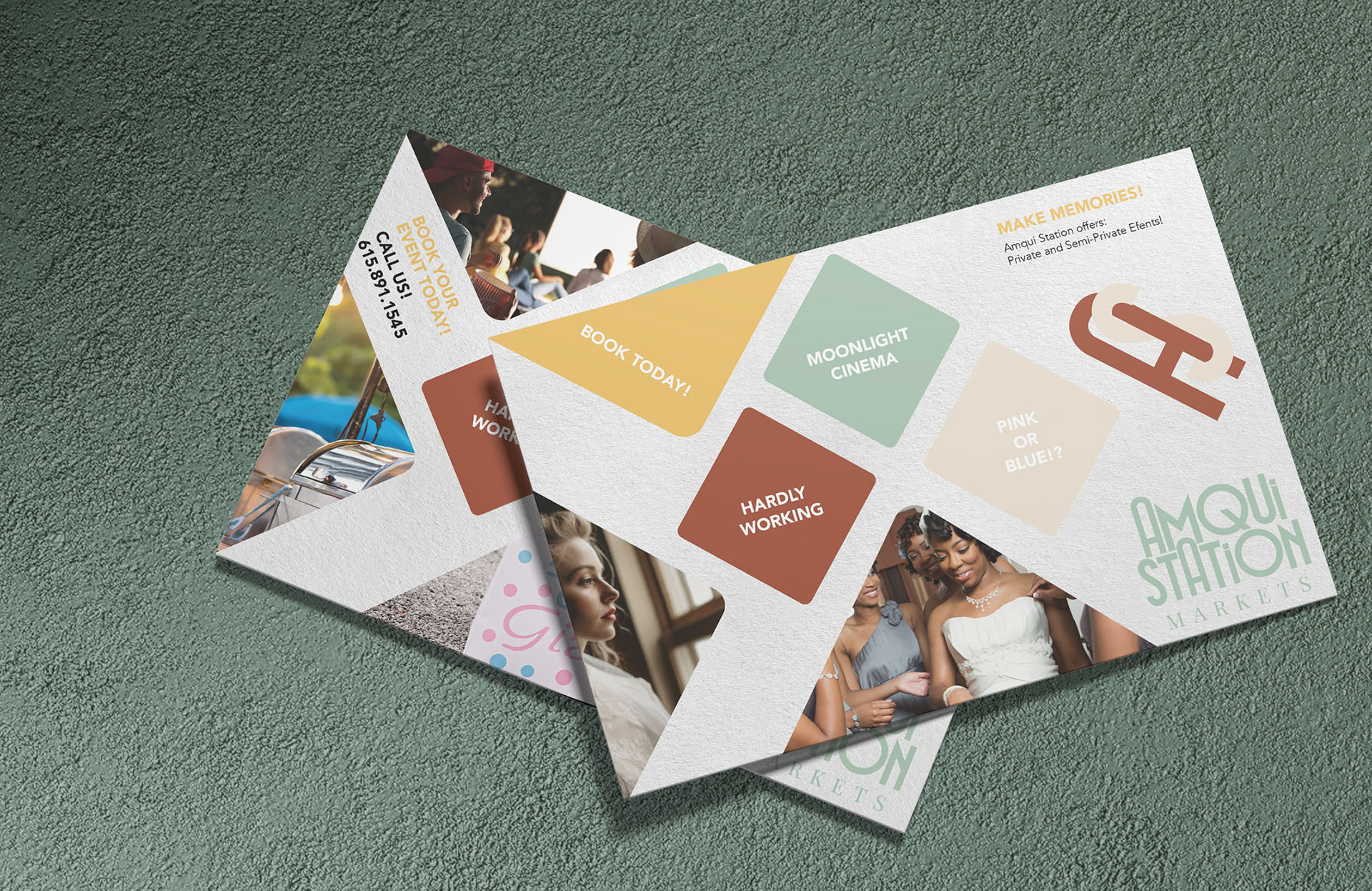
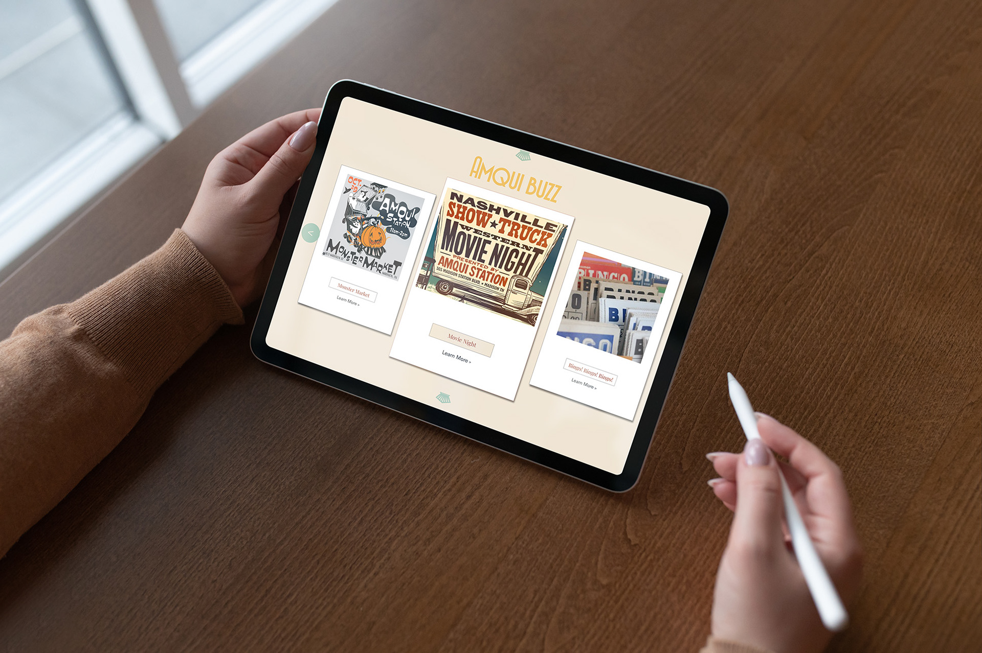
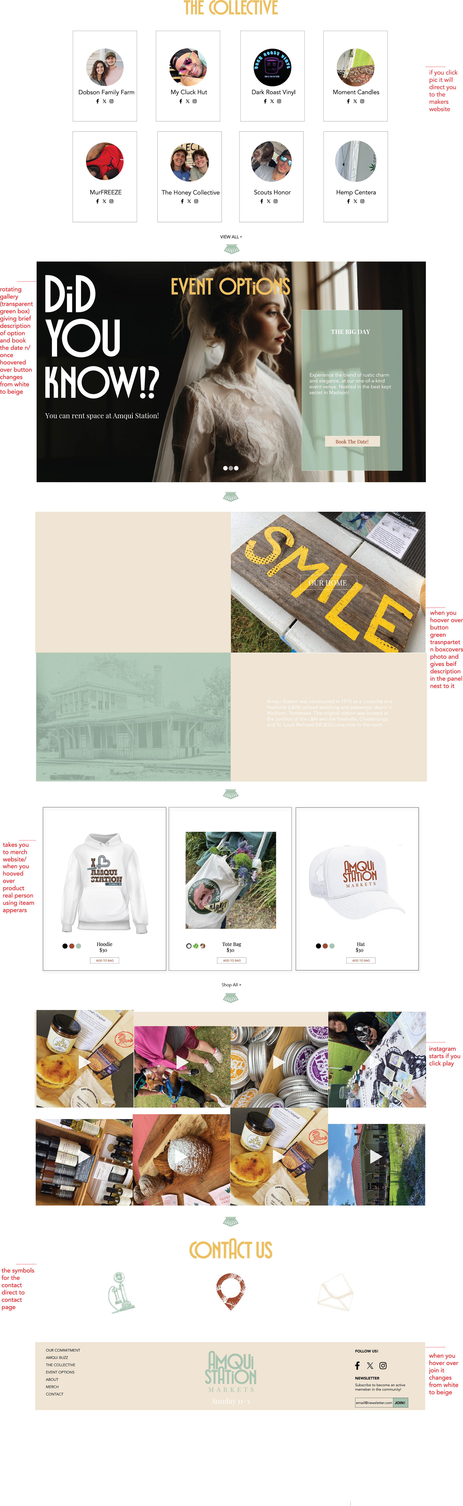
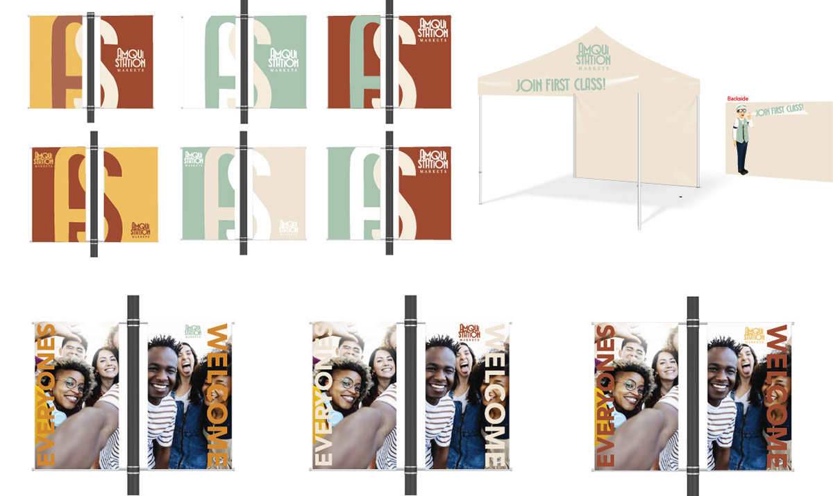
I designed a cohesive website experience featuring a welcoming landing page, an organized services and events page, and a dedicated merchandise page to support online engagement and conversion. Each page was structured with clear hierarchy, intuitive navigation, and brand-aligned visuals to improve usability and highlight key offerings. Within the website experience, the red text along the sidebar on the landing page functions as a guided, interactive walkthrough—demonstrating how users navigate and engage with the site in real time. In addition to the website, I developed targeted marketing assets, including EDDM, Mailchimp email campaigns, and Instagram social ads—ensuring consistent messaging and a unified brand presence across both digital and physical outreach. To further extend the brand into the physical environment and support vendors upon becoming part of the collective, I incorporated a registration component that provides vendors with a complimentary branded signage display and the option to purchase an Amqui Market tent display, reinforcing visual consistency, improving on-site visibility, and creating a clear, welcoming point of recognition for visitors.
(Certain merchandise designs shown were created by or in collaboration with other artists. I do not claim ownership of the legal rights or copyrights to those works. These designs are displayed solely for portfolio reference and promotional purposes to demonstrate creative capability.)
Style Guide
This rebrand for Amqui Station Markets establishes a clear and cohesive visual identity built on warmth, community, and modern simplicity. The color palette features earthy neutrals, fresh greens, and rich accents, paired with a modern sans-serif headline font and a clean, readable body typeface. The brand evokes authenticity and approachability across all applications. Logos must maintain proper spacing, proportions, and approved colors, and should never be distorted, or recolored (Unless approved for collaboration). Typography should follow the established hierarchy and approved fonts, avoiding decorative or unapproved typefaces to ensure consistency.

Creative Brief & Gif
During the initial client interview, I gathered key insights to ensure the rebrand remained authentic and rooted in Amqui’s rich history while evolving the visual direction for a modern audience. The creative brief outlines the core pillars of the brand—The Big Three: foundation, visual identity, and brand voice—establishing a clear and thought out framework for all design decisions. It includes logo development and application, merchandise concepts, signage direction, website structure, and brand usage guidelines such as logo and typography do’s and don’ts. A strong emotional emphasis drives the overall strategy, focusing on community connection, local pride, and a welcoming experience that honors the legacy of Amqui Station while supporting its continued growth.
(The original conductor illustration was created by an anonymous illustrator; however, I updated the character to align with the new Amqui brand standards and fully redesigned his attire accordingly. I also animated the character and developed a branded GIF for digital use.)

“All mockup photos are sourced from licensed stock imagery and are presented exclusively for design exploration and visualization purposes. Created for portfolio purposes only.”